Friday, September 30, 2011

Spectrafranken - Purple Haven

Another spectrafranken today, cause I have so much fun creating them I just can't stop myself.

As soon as I created this polish I instantly knew who it reminded me of.  Kristy from the Polish Haven. You see Kristy has an addition problem with purple polishes, so I have named this franken after her blog. Purple Haven.  

When I went to create this franken, I was looking through all my Ulta3 swatches looking for something dark, but with a jelly finish.  I spotted Gooseberry, which is a very dark purply plum, the clear polish and the spectraflair really lightened it up and created this soft dusty purple.  I really love it.


This was make using:
  • 2/3 bottle of Ulta3 Gooseberry
  • 1/3 clear polish
  • 3 incy wincy straw spoonfuls (each the size of a grain of rice) of Spectraflair coarse grade
Don't forget to get creative and email me your spectrafrankens and/or colour morphing frankens, and go in the drawn to win three Picture Polishes.

Thursday, September 29, 2011

Ozotic 601 - the other one

I did this swatch two weeks ago, when we were having the most amazing sunny and warm spring days (and when my ring finger hadn't grown out to match the others yet).  Now the weather is horrible with rain and storms, but at least my ring finger looks normal again.

Anywho, when I first posted about Ozotic 601 I showed an amazing large particle holo, with very a obvious linear rainbow. I suspect a few ladies may had gone and bought it then and I feel my pictures might have mislead people. Because then I started seeing swatches pop up of 601, and they looked totally different to mine, and I hate to say it, not as holoie as mine.

It killed me knowing that there was another version of this, so I had to get it to compare.  This is the new version of 601 which is the version Picture Polish sell.  My older version was sourced from Tip Trendz, who have now sold out and restocked with the new version too.  So if you don't have the older version already, too bad, so sad :(


The new version is a much brighter pink.  It still has a scattered holo effect, but nothing like the older version.


Here are the two bottles lined up.  The older shape on the left and the new one on the right.  Although now of course the bottles are rectangle.


This is how they compare on the nail.  The colour difference is very obvious, but in real life, so is the holo effect.  The new version is totally out holoed by the older version.


See, way more holoie goodness on the older version. Why is that? 


Man it makes me crazy when a polish brand changes the colour of a polish.  I know that the Lumineye website says they hand mix small batches of polish, so there would be some colour differences, but seriously if you follow a standard recipe for a polish it should be a little more similar than these two.

New 601, why can't you be more like your older sister 601!

Wednesday, September 28, 2011

Show me your frankens and win Picture Polish!

Ok peoples. I want to do a future blog post that shares your franken polish creations that use either the colour morphing powders or spectraflair.

You see, today's spectrafranken was inspired by Cute-tickle Nails blog post about a wanting to create a deep chocolate brown holo.  Her franken inspired this franken, and I want you all to be able to see what others are creating and get inspired with your pigments.

My future blog post will have photos and links to your blogs and photos of franken polishes created using colour morphing powders or coarse grade spectraflair. I hope it to serve as a portal through to all your amazing polishes from one location. AND if you send me your link/photo then I will put you into a draw to win any three Picture Polish shades of your choice - and let me tell you there are some awesome PP shades to choose from!

So, if you have a blog, you just need to email me a link to your blog post about one of your frankens (which use either a colour morphing powder or coarse grade spectraflair).  You also need to give me permission to post one of your photos on my blog together with a link.

If you don't have a blog, you just need to email me a photo of something you have created, swatched (preferably on your nail, but a wheel pic is ok too) and allow me to post that photo on my blog.

Easy right.  My email is morenailpolish@iinet.net.au and I'll give you two weeks to create something and send it to me.  You can send me links after that date of course and I'm happy to update my post, but I will randomly draw a winner for the three Picture Polish shades on 14 October 2011.

So now onto my franken polish inspired by Cute-tickle Nails franken polish.  This is my 'frosted chocolate cake'.  It's a deep chocolate brown, with a golden shimmer and pretty rainbow holo.


The recipe for this (in a small 5ml bottle) was:
  • 2/3 a bottle of Ulta3 Chocolate Cake 
  • 1/3 a bottle of Clear polish
  • 2 small straw spoonfuls (about the size of a grain of barley) of TKB Copper Sparkes
  • 3 incy wincy straw spoonfuls ( each the size of a grain of rice) of Spectraflair coarse grade
The TKB Copper Sparkes turned the creme Chocolate Cake polish into a shimmer, which I really should have swatched before I added the spectraflair, cause it was so pretty.

Anyway, get frankening ladies, and lets inspire each other!!

Tuesday, September 27, 2011

Chemistry 523

Oh man, please tell me, if you have a full time job, small children and a blog, where do you find time for all of it?  Of course the only thing out of those three that can be neglected is the blog. Not that I have neglected my blog (not yet anyway), but I can feel my blog mojo (can I call that my blojo?) fading a little at the moment. 

Ok, enough whinging from me and onto the polish.  Today it's another Chemistry polish, #523.  This one was sourced from another awesome blogger friend with access to the Essential Beauty warehouse. Shatter me Claire scored this one for me.  I first saw it on her blog and pretty much begged her to get it for me, which she so very kindly did *blows kiss*.

Chemistry #523 is in the 500 series, which means it fits in with all the other Ozotic/Chemistry multichromes, but again, just like the last polish, I don't think there has ever been an Ozotic version.

It's a bronze multichrome that shifts from light gold through to almost a chocolate brown.  The shift isn't strong, but it gives the polish dimension and that little something different.  This was two coats over black


Above photo taken indoors, below in the sun.


Here you can see the darker brown colour shift.  It actually really feels like an Autumn shade.  Which of course it's spring here at the moment, but I can really see me wearing this a lot come the end of summer!


So that's the last one of my Chemistry/Ozotics/Artform polishes to add to the colour guide.  Actually no that is not quite true as I have the other 601 to post about too.

Sunday, September 25, 2011

Chemistry 618

Today I have another Chemistry polish, number 618, which is a light green large particle scattered holo.

The absolutely awesome Kristy, who has the most perfect nails on show over at The Polish Haven, recently grabbed this Chemistry polish for me.  I wanted to try and fill in any gaps I had in my Ozotic/Chemistry colour guide, and she kindly went searching the Chemistry warehouse and found this.

This polish is pretty much the scattered holo version of 517, which is the light green linear holo. A lot of these polishes in the 600 series have matching colour twins in the 500 series, which is pretty nice if you like to mix up the finish on your nails.


The holo effect isn't as pronounced on this polish.  It really reminds me more of the Milani 3D polishes.  In fact I think I should do so comparisons with the Milani 3D polishes against these Ozotic/Chemistry 600 series.


I haven't seen an Ozotic equivalent of this polish, and from what Kristy tells me, the warehouse that sells these is pretty much empty, and they don't even know if or when they will be getting any more *sad face*.  I love these chemistry polishes, their bottles stack really nicely and they have the longest wand.  I really hope they do restock in the Chemistry name, rather than just stocking the Ozotics like Artform Nails are doing (apparently some day they will be available on their site anyway!)

Friday, September 23, 2011

Picture Polish Metallic Mush

I have been eyeing off this Picture Polish shade for a little while, and when they organised the Blog Fest, this was one of the polishes that I went searching for.  I found the blogger swatch over on Sawan's blog where I thought it looked beautiful, so I decided to grab a bottle.

If you have a bottle of Picture Polish, you would know that each colour has it's own saying written above the polish name.  On this one it is "Watch out this maybe magic!".  I know Sawan comments that she didn't quite get it and to tell you the truth, neither did I.

But as I was waiting for this to dry, it suddenly dawned on me what it meant.

The shade a beautiful foil metallic in a very pale mushroom pink.  Ahhh! *light goes on above head* "Metallic Mush", is short for Metallic Mushroom.  And the tag line of "Watch out this maybe magic!", is making a play on the magic mushroom, you know the hallucinogic kind!.  So I get it now, but what I don't get is why it is "maybe" and not "may be".  


Metallic Mush is a beautiful metallic foil, with warm tones, which is what makes it so pretty and different from just a regular silver foil. In the sun (above) it really sparkles, but even in the shade it looks brushed metal.  I still love these bottles, the shape is just perfect for stacking, and they have one of those slightly grippy, rubberised handles that makes them so easy to open.


Of course as soon as I wore it, the alarm went off in my head *dupe alert, dupe alert*, so off I went to my stash to pull out Ulta3 Envy.  My bottle of Envy is a few years old now, and it really needs to be thinned.  Of course I didn't thin it, I just put it on, so I did find it thick and gluggy compared to applying Metallic Mush, which was smooth and shiny to apply.  e


On the nail and in the bottle they are pretty much identical, and it's only because I took a chunk out of the polish on the tip of my ring finger that I can recall which was Envy and which was Metallic Mush.  I was really hoping they would be slightly different.  I still love the colour though, so maybe I will use one bottle for marbling or frankening.

China Glaze Cat's Eye

Today's awesome nail colour is China Glaze Cat's Eye.

With a name like that, there was no way ever, that I was not going to own this polish.  It's a discontinued polish, but I wouldn't say that it is hard to find.  I got mine off ebay recently, for far less that retail price in Australia.


It is a beautiful green toned gold., which is a little sheer.  It needed three coats for full opacity.  It also has a slight tendency to streak, but I was generally able to keep those streaks straight.  Although my index finger is a little wobbly.

What I absolutely love about this polish is that when you look at it closely you can see a orange and green shimmer.  The speckled shimmer almost seems to float on top of the gold base colour.  You can see the green and orange clearly in my index finger below.


Here is a macro where you can see the sparkling dots of green and orange.


We have several kitties, but certainly our little Nahla has eyes just like this polish.


And yes, I have managed to add another gold polish to my expanding collection, which must be made up of at least 25% gold polishes!

Thursday, September 22, 2011

Black and Gold dry water marble

For my first day back at work last week, I wanted to have something a little fancy on my nails.  The best part is, someone noticed! She even knew it was water marbling!  She was wearing OPI black shatter over silver and showed me photos of her mani wearing CG ruby pumps.  It was so fun to have found someone at work that spoke the same crazy nail polish language as me!

Anyway, back to the mani.  On Sunday night I sat down to apply another dry water marble and here is the end result.  It's my best one so far and I loved it.


I had actually done a little water marbling session with my mum, where we tried different combinations, different brands of polishes and different stroke marks through the water.  So I had quite a nice little selection of round plastic marbling pieces to select from.  As you can see, I only had two black and gold ones to select from, and I ended up with more than half of one left.  So I love that this doesn't waste polish and the clean up was so easy!


If you didn't see my step by step guide to dry water marbling, then please check out my previous post about it.  Although please look at this final mani, as it was soooo much better than my original two that I did.  

I think the fact that the marbled plastic was nice and dry cause it had been sitting in my nail box for a week made a big difference with the top coat bubbling.  I didn't get any bubbles at all this time.  I also did a much better job at sticking the marbles down, using just one coat of polish underneath.  

Has anyone else tried dry water marbling yet?  How did it work out for you?

Tuesday, September 20, 2011

Ulta 3 Spring/Summer 2011 collection Part 2

Alrightly then.  Here is part two of the collection. I've put all the greens together so you can compare them.

Tahitian lime - three coats, no top coat, full sun.  A bright lime green.  Yellower than Jelly, but also much more opaque. I'm not too sure about this colour, it's really, really green.  And we all know it's not easy being green.  In fact it really is kermit the frog green!


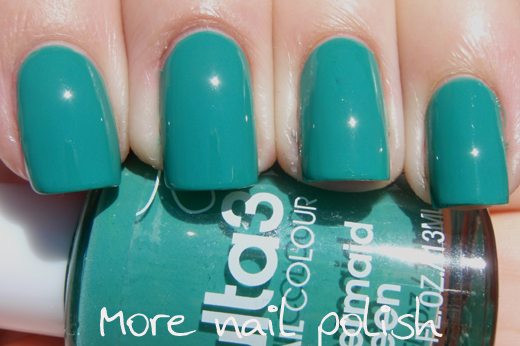
Mermaid green - two coats, SV top coat, full sun.  This is a really pretty blue green creme.  I'm sure there would be other brands that have similar a colour, but I don't own many creme polishes in other brands, cause I generally wear shimmers, flakes, glass flecks or holos. So if you know what other colours it looks like, please let me know.


Mojito - yuuummm yes please. Two coats, no top coat, full sun.  I'm finding it really hard to describe all these different green shades.  But hey, you can see what colour it is, right?  I probably should have done a third coat on this one, it's not streaky or anything, but I can see VNL.  Does that make it a jelly polish?


Orchid - one coat, no top coat, full sun.  Orchid feels a little like the odd man out.  I feel like singing  in sesame street tunes "One of these shades is not like the others, one of these shades just doesn't belong, can you tell me which ..." and so on.  So yeah, here we have an amazing purple shimmer, in with a bunch of creams.  

Remember the Autum/Winter collection with all the fever polishes.  They were all shimmers with the exception of one purple creme.  And now here is the purple shimmer in amongst all the cremes?

Anyway, to me, this polish is the stand out.  This is only one coat.  The formula of this one was so much easier to work with than all the others, and although it uses the same brush, it didn't drag.  If you only grab one of these polishes, this is the one to get.


I loved it so much that I decided to stamp it with China Glaze 2030, using a Bundle Monster plate and wear it for a few days.


I've worn this mani for three days now and am pleased to say that the staying power of this polish still seems to be great.  I was worried that because they are now made in China that they would go all chippy and horrible, but if this one is anything to go by, it was great.  I wore it with:
  • Orly bonder base
  • one coat of Orchid
  • stamped with CH 2030
  • Seche Vite top coat.

Monday, September 19, 2011

Ulta3 Spring/Summer 2011 collection Part 1

Last week I discovered that my favourite little cheap chemist brand had released a new spring/summer collection.

Usually Ulta3 polishes are just jumbled up in a great big white tub at the entrance to a chemist, and you have to rummage around through all the bottles to search for a colour you might like.  This time around however, they were actually in a plastic display unit, displaying four of each colour.  Check out this pic of the display unit posted by Shamisen on the Vogue forum.  It actually looked much more up market than I usually expect of Ulta3.

Here are all the new colours.  There are eight of them, which I will split into two posts.


Blue Marlin - three coats, no top coat. Photo taken outside, but no sun (although you can see the pretty clouds reflecting on my nails).   This one is almost a blue jelly, but with less than three coats it was a little streaky.  Fantastic colour and it didn't seem to stain nails either.


Frangipani - three coats, SV top coat, full sun.  Bright yellow, but not fluro like Citrus but brighter than Honolulu.  This was thickish and streaky, but the finished mani is really great.  I've finally added another yellow to my polish collection.  I think this officially makes 4 yellow polishes that are purley yellow, not gold.


Sunset pink - three coats, SV top coat, full sun.  Bright pink with blue tones, almost fluro.  Amazing colour saturation with this one.  I feel a little like a five year old wearing this, and that i should be wearing hot pink leggings with sequined shoes.


Tangelo - three coats, SV top coat, full sun. Bright fluro orange coral pink.


When on the nail, I immediately thought that Tangelo was a dupe of Tahiti. Tangelo is a margin paler, but not so much that you actually can tell.  


I'm actually really loving these colours.  They are bright and they certainly make me feel warm and summery.  I guess it helps that it was 27 degrees here yesterday!

These polishes are now made in China, not Australia, which is a bit of a bummer, cause I loved being able to wear a cheap Aussie made polish.  The bottle lids are also slightly different, the top edge is slightly rounded now and the white cap is slightly more translucent.  I found the brushes to be really stiff and really hard to work with.  I don't know if it was because all of these colours felt rather thick or if it was the stiff brush, but I found that the brush left deep ridge stroke marks in the wet polish.  These marks generally leveled out as the polish dried, but there a few fingers that stayed a little bumpy and needed top coat to make them look smooth.

If anyone wants to see a comparison swatch between any of the new colours and the existing colours, please let me know.

I'll show the remaining four colours tomorrow.

Sunday, September 18, 2011

Peripera Metallic Green

Rounding out my four Peripera polishes is the magnificent blue green duochrome that is Metallic Green.
I really did save the best for last with this one. I believe this is also a dupe for Missha HGR001.

It's looks a lot like a metallic foil, but it is slightly frosty, which means a few streaks.  I really don't care about the streaks in the finish, because it is just so damn beautiful.  This first photo is in the sun.


On the angle, you see the bright blue flash that this green polish shifts to. Taken indoors with no direct sun or light.


Front on, indoors - with short stumpy ring finger which has now almost grown out to the length of the others in the two weeks since I swatched this.


I tell you, these cat bottles are the cutiest thing EVA, but damn it makes it hard to hold your fingers in a level and attractive post for a swatch photo.

After wearing it for a day or two, I thought I would try a star explosion, a la Nailside style. The idea was good, but my application terrible.  I loved the colour combo I did though, which was Tony Moly Neptune. I haven't got around to swatching (let alone wearing a full mani) of my Tony Moly's yet. I also mattified the whole thing to give it a totally different look.